← Work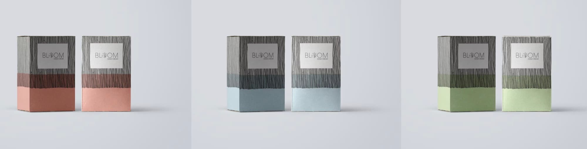
Personal Care · Packaging
Bloom Hand Cream
A full brand identity and packaging system for Bloom Hand Cream, built around a hand-drawn linework mark and a warm, considered colour palette.
The challenge
A hand cream brand needed an identity that felt tactile and considered on the shelf, distinct in a category full of clinical, oversimplified packaging.
The approach
We built the identity from the mark outward: a hand-drawn linework logo, a restrained colour system carried consistently across each variant, and packaging structure designed to feel as good in the hand as the product itself.
What this involved
- Full brand identity: logo, colour system, packaging structure
- Consistent shelf presence across multiple product variants
- Packaging design built for a tactile personal care category
Part of Brand in Motion.
Want something like this? That starts with a five-minute conversation about what you’re actually trying to build.